The Most Common Wayfinding Signage Mistakes
One thing I’ve learned over the years is that people rarely notice great wayfinding signage.
They simply arrive where they need to be without thinking about it. It’s only when the signage doesn’t work that people become frustrated.
We’ve worked on wayfinding projects for hospitals, schools, offices, retail parks and public buildings, and the same mistakes tend to crop up time and time again. The good news is that they’re all avoidable if you think about the people using the space before the signs themselves.
Trying To Put Too Much On One Sign
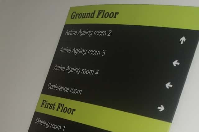
This is probably the mistake I see most often. It’s tempting to list every department, room or destination on a single sign, but the more information you add, the harder it becomes for someone to find what they’re actually looking for.
Good wayfinding is about guiding people one decision at a time. Each sign should answer the next question in their journey, not every question they’ll have throughout the building.
When information is broken down into simple, logical steps, people naturally feel more confident moving through the space.
Being Inconsistent
Consistency is everything. If one sign says “Reception”, another says “Main Office” and a third says “Customer Services”, visitors begin to question whether they’re heading in the right direction.
The same applies to colours, typography, symbols and layouts. A wayfinding system should feel like one complete family of signs rather than lots of individual designs created at different times.
When every sign follows the same visual language, navigation becomes much easier for your visitors.
Installing Signs In The Wrong Place
Even the best-designed sign won’t help if people only see it after they’ve already walked past the decision point.
We always spend time understanding how people naturally move through a building before recommending sign locations. Entrances, corridors, junctions, lifts and staircases are where visitors make decisions, so that’s where the signage needs to be.
A proper site survey nearly always highlights things that aren’t obvious on a floor plan, which is why we never like to guess.
Forgetting You’re Designing For People
Buildings make sense to architects and facilities managers because they know the layout.
Visitors don’t know any of this. Someone arriving at a hospital appointment, visiting a university for the first time or attending a meeting in an unfamiliar office is often distracted, stressed or in a hurry. They aren’t studying the signs; they’re scanning for quick reassurance that they’re heading the right way.
That’s why we always think about sightlines, lighting, viewing angles and how people naturally behave before we think about the graphics.
The best wayfinding systems feel intuitive because they’re designed around human behaviour, not just building layouts.
Forgetting To Update Your Signage
Buildings rarely stay the same. Departments move, businesses expand, offices are refurbished and new facilities are added. Unfortunately, the signage often gets left behind.
We’ve seen plenty of buildings where old signs point to departments that no longer exist or where temporary signs have become permanent fixtures.
Reviewing your wayfinding signage every few years keeps everything accurate, maintains confidence and gives visitors a much better experience.
Wayfinding Should Feel Invisible
When your wayfinding scheme is working properly, nobody talks about it. People simply arrive where they need to be without stopping, second-guessing themselves or asking for directions.
That’s always our goal at Signage Systems. We design wayfinding systems that work for real people, reflect your brand and continue performing long after they’re installed.
We’re Always Looking for Talented Sign Makers
Whether You’re An Experienced Sign Maker, A Highly Capable Sign Installer, Or Someone With Hands-On Technical Skills Who Wants To Grow Within An Established Business, We Want To Hear From You.